What We Delivered
A Logo That Adapts & Evolves
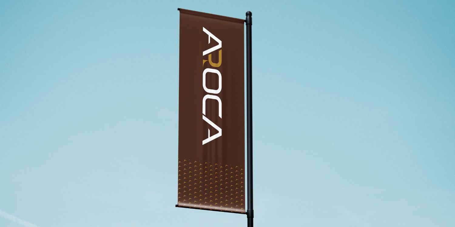
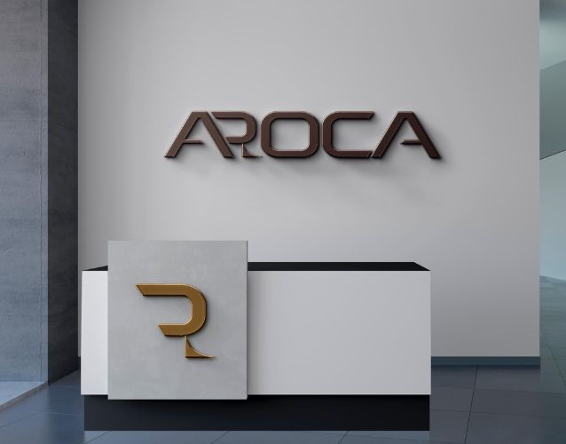
Aroca Group required a logo that not only represents the parent company but also serves as a foundation for its sub-brands. We designed a modular brand identity with a sleek, professional look that remains recognizable across various industries. To maintain and unify the visual identity of the multiple sub-brands, DAB Technology created a logo symbolizing a distinctive ‘R’ icon.
A Logo That Adapts & Evolves
Aroca Group required a logo that not only represents the parent company but also serves as a foundation for its sub-brands. We designed a modular brand identity with a sleek, professional look that remains recognizable across various industries. To maintain and unify the visual identity of the multiple sub-brands, DAB Technology created a logo symbolizing a distinctive ‘R’ icon.
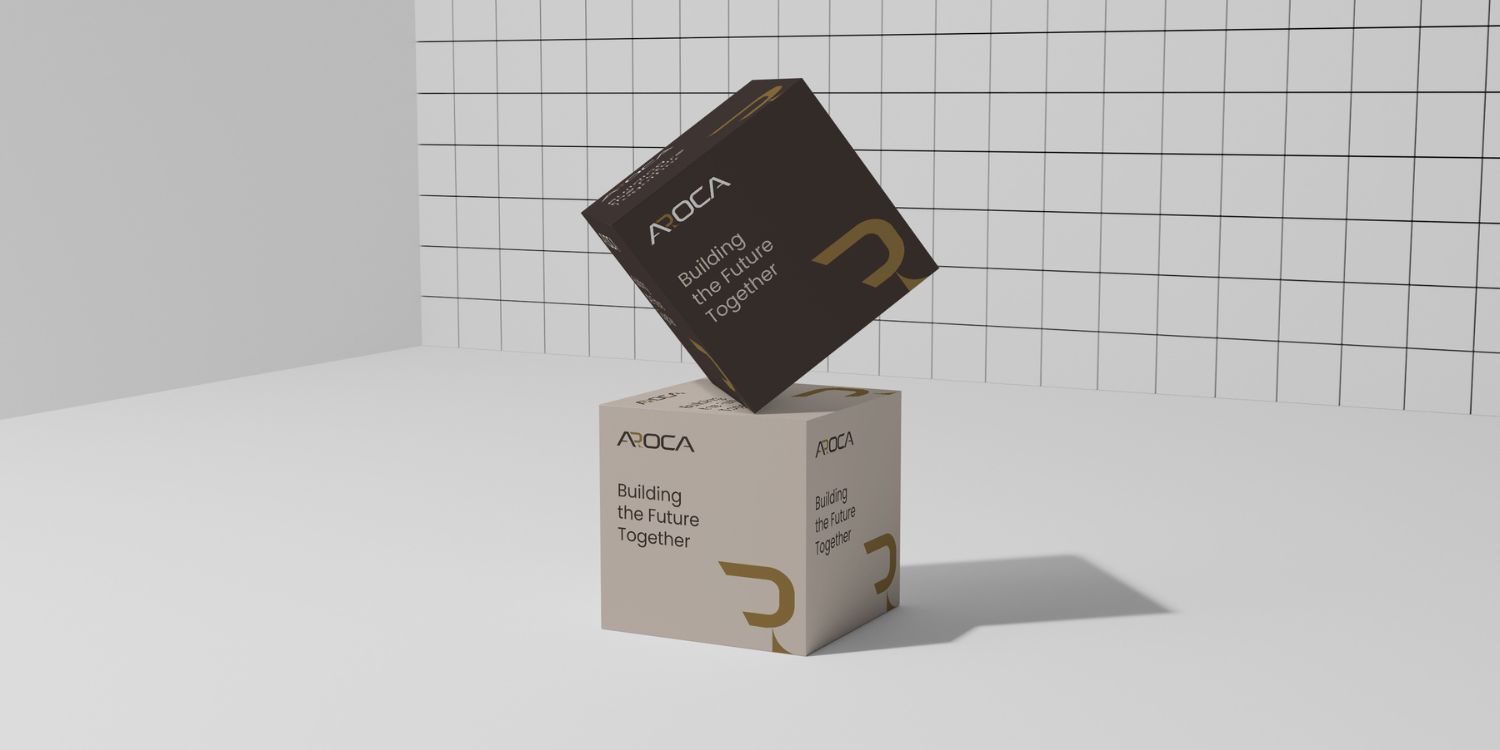
A Scalable Brand Architecture
To ensure an easy and convenient brand transition for future entities, we implemented a brand architecture system. This allows Aroca to maintain a strong corporate identity while offering flexibility for its expanding business portfolio.
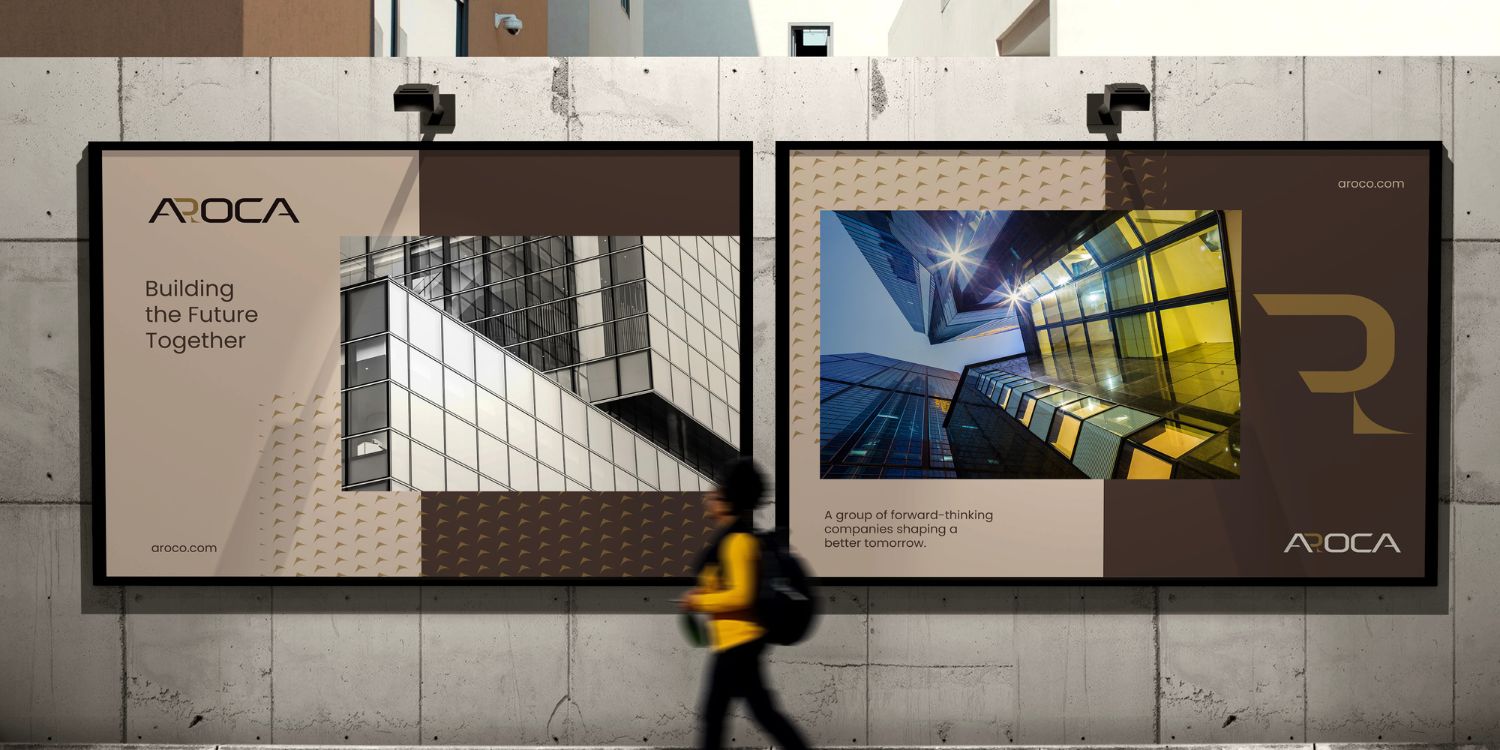
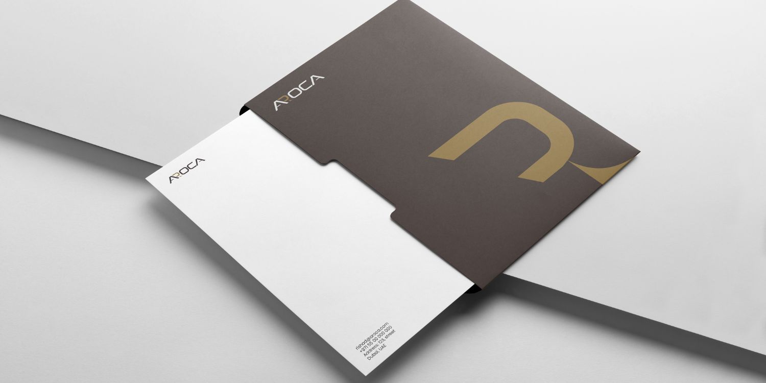
A Cohesive Visual Identity
From typography to color schemes, we provided a consistent branding system that strengthens Aroca’s overall market presence. We had only one goal in mind, to follow a design approach that ensures that every brand under the Aroca umbrella remains connected yet distinct.
The Impact
-
A scalable branding solution that supports Aroca’s future ventures.
-
A unified identity that enhances brand recognition and market authority.
-
A seamless brand experience across all business verticals.
By combining strategic brand architecture with innovative design, DAB Technology helped Aroca Group build a brand identity in Dubai that is strong, flexible, and future-proof.